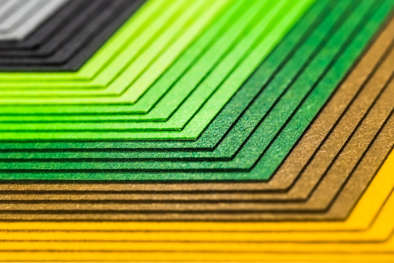
Choosing the right paper for your piece can be straightforward but sometimes it gets a little tricky. Paper can tell a lot about your product and your business. It conveys a personality, when the consumer holds it in their hands it influences the entire interaction. Do you want to convey high quality? What about durability? Ruggedness? Delicacy? Brilliance?
Even if the consumer doesn’t hold your product, do the colors pop? What feeling does the visible texture convey? Your stock choice can help your product jump off the shelf or cut through the marketing clutter customers wade through on a daily basis. But where to get started?
A Good Place to Start
Think about your brand, the composition of the piece, the intended lifespan and your budget. These four factors can help you narrow down your options from the seemingly endless array of stock to a manageable few. Make a list of adjectives that describe your brand and the design of the piece. This will help you identify a texture that would complement your piece well.
|
Coated Sheet |
Uncoated Sheet |
|
Photographs Illustrations Things that should |
Books Daily Magazines Pieces with a lot of text |
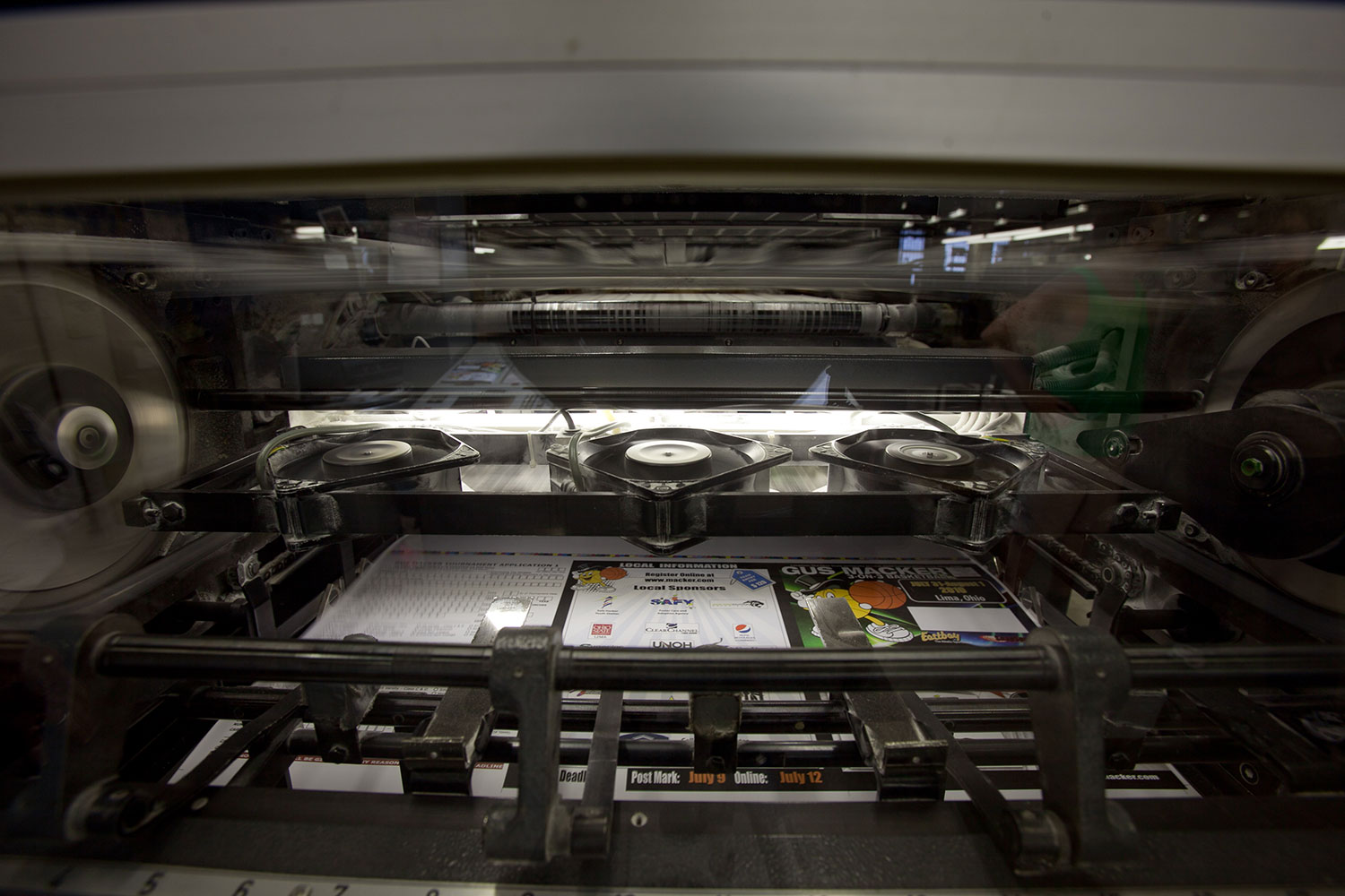
Now let’s think about the content of the piece. This will help us determine if you need a coated or uncoated sheet. Is it mostly text or are there lots of photos? Is it four color or black and white?
Ink interacts differently with a coated sheet than an uncoated sheet. A coated sheet has a coating of china clay or other kind of coating that conveys a gloss or other texture to the sheet. Matte, semi-matte, silk and gloss are examples of coated sheets. In general a coated sheet is better for photographs or illustrations with a lot of color with the exception of matte finishes. Because of the coating, the ink doesn’t absorb as much into the paper. Instead the ink adheres to the layer of coating and dries above the paper, making it more vibrant.
An uncoated sheet has a rough, natural feel. Because there is no coating between the paper and ink the ink soaks into the top layer of paper and sinks into the fibers beneath. Uncoated papers are great for designs that need a natural earthy or more rustic feel. Large amounts of text can also benefit from printing on an uncoated sheet. The gloss of a coated sheet can cause a glare from nearby light sources making it difficult to read.
If you have a piece that needs a unique texture there are a wide variety of textured sheets. These are available in leather, alligator, vinyl, canvas and more. For more information on textured sheets and metallic sheets, continue to the Specialty Papers section below. Check out the Resources section to browse online paper manufacturer catalogs.
Other Considerations
Coated versus uncoated is the most basic difference between papers but there are other features to consider if you want to maximize your piece’s effectiveness within your budget.
Budget
All too often we have a vision of what we want our final product to be only to learn the added cost makes it prohibitive. Sometimes you just need to get the piece printed as cheaply as possible, if that’s the case, consider asking your printer what their house stock is or if anything’s been overstocked. If you are budget conscious it still pays to pay attention to what stock is chosen, remember, uncoated stock is not always cheaper than coated stock.
Thickness and Weight
| Weight | Common Use |
| 20 – 24# | Standard Weight |
| 24 – 28# | Poster Weight |
| 80 – 100# | Business Card |
Paper weight can be measured a couple of different ways. The common used in the United States is the pound weight of a 500-sheet ream of 17″ x 22″ bond paper. Pound is often abbreviated with the # sign.
This measurement is what you see on a package of printer paper at the store. It may say 20#, 8.5″ x 11″. We all know that a ream of printer paper doesn’t weigh 20 lbs. so why is it called 20# weight? Well, remember that the paper weight is calculated on a ream of 17″ x 22″ paper. After this is cut into fourths to achieve the 8.5″ x 11″ size it no longer weighs 20 lbs. Next time you buy a ream of printer paper, check the paper weight then weigh it on your bathroom scale, is it roughly 1/4 the listed weight?
Now you know how it’s calculated, but how do you choose the right weight for your project? In general the heavier the paper weight the thicker the paper is. If you are working on a piece that will be mailed, remember that paper weight can affect your postage cost, a variable that adds up quickly.
When printing a booklet, or any covered piece, it is common to use a standard weight (20-24#) for the inner pages and a cover stock (65 – 80#) for the cover. This lends your piece a little more stability.
Although thickness and weight are related they are not directly proportional, especially with coated stocks. If you need to know the thickness of the sheet you want to pick a stock by its caliper size. In the United States these are measured in points or mils (1 mil = 0.001 in).
If your piece requires a lot of folding it is important to know that thicker stock often requires scoring to achieve a crisp fold. For any other considerations, consult the chart about most commonly used paper types. If you are not sure what paper weight is best, talk to your sales representative.
Finally, remember to consider the piece’s lifespan. It may be worth using a less impressive stock for a pamphlet designed to be read once and recycled versus a rate card or other reference piece your customer’s will keep for an extended period. A thicker, more durable stock is desirable for a piece with a long lifespan but may be cost prohibitive for a disposable piece.
| Bond and Writing | Book and Offset | Coated Papers | Cover | Index, Bristol and Tag |
| Used for letterhead and business forms, this paper is designed to function well in printers, readily accept ink from pens and erase pencil easily. | Available in a wide range of weights, these usually have an antique or smooth finish, this is one of the most common paper classes used in commercial printing operations | These are essentially book papers with an additional glossy or matte coating. This gives the piece a more striking, high-quality appearance. | This stock is thicker and more rigid than book paper. This is ideal for calendar or booklet covers. Posters printed on cover stock hold up longer. | These are very thick stock. They receive ink well and are extremely rigid. Index and bristol are good choices when you need inexpensive, stiff stock. Tag stock is used mainly for manufacturing tags. |
Opacity
Opacity is a simple concept, it is exactly what it sounds like: a measure of how much light can be seen through it with 100% being no light. When trying to cut cost it is common to simply use a cheaper paper stock in production. If you are doing this it is important to keep an eye on the stock’s opacity, especially if you’re printing on both sides. A stock with low opacity and printing on both sides can lead to low readability as consumers will be able to see the text on the reverse showing through the page. Opacity can change depending on the type of fillers used, weight, whiteness or coating.
Brightness
The brightness of a stock is based on the percentage of a specific wavelength of blue light the sheet reflects. Brightness is expressed on a scale of 1 to 100 with 100 being brightest. The brightness of a paper can have a large effect of readability, the perception of ink color and the contrast between light and dark hues.
Specialty Stock
If you want a specialty texture or metallic appearance there are many specialty paper and plastic options available. If you have a specific texture in mind, browse the links in the resources section below or call your commercial printer for assistance identifying the right stock for your purposes.